


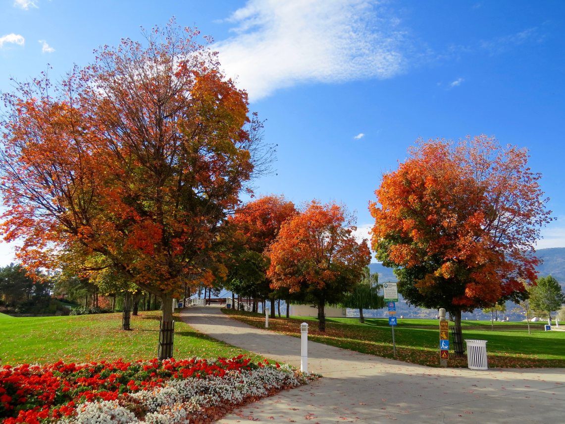
Hey, it’s Autumn again!
As the earth begins its solstice, nature around us slowly welcomes the change of seasons with a change of colours. As we step into our newly coloured days, it signals another moment of joy. Colours are always intimate, filling us with a constant expectation of something and needless to say, reminding us of something as well.
This autumn, I’m going to do something a bit different from the past. Instead of showing you the exciting places I’ve been to, I’m going to share with you my theme of colours for this season.
Colours play a huge part in our life. Everywhere we go, whatever we eat and whatever we do, it all involves colours. Even nature tantalises and inspires us with unique shades of colours every time of the year. I think if we were to live without colour, our lives would be very dull and monotonous. Colours help create emphasis and differentiation in our lives.
We can almost say that colours flow through our blood, healing our emotions, spiking our senses, capturing our attention and much more. It even penetrate thoughts and perceptions and embody new ones. The amazing mystical work of colours alone has sub-consciously impacted and affected our lives in so many ways and for so many generations. Some people even say colours are in our genes!
Colours, when used creatively, can have a very positive effect on our body of presentation. From my personal travel experiences, I have come across many unique shades and tones of charm not just in nature, but also in the choice of colours the local folks have on their buildings. Some are quirky, some in utter contrast and some just plain sublime. Yet, they all create fond respectable memories of those places.
By taking photos of picturesque scenes, I try to seize the moment to share the beauty of those places as seen through my own eyes. But sometimes, our imaging devices cannot reproduce the accurate colour receptions that we first visualised in person. What our eyes view and brain perceives may not be the same as what our digital imagery device understands. Hence the need for the ‘rebalancing’ of those images.
For some of the images I have shared through my blog, I would even add or adjust shades of colours so it may theme into my blog post, email newsletters or even Pinterest covers. Some are also ‘rebalanced’ to be as close as real-life as possible. By doing so, I hope it can instinctively add influence to a reader’s mood, capturing their attention and motivate them to travel.

Colours can help in ‘representing’ or emphasising the tonality of a blog theme especially for themed blog posts. For example, if I were to write about my yoga experience, I would simply choose the colours blue and green to ratify the methodical-mystiques of yoga. Or if I were to share about a personal success story, orange and red are perfect colours to bring about impact and effort.
Colours need not necessary be solo. It can be combined with many other colours just as we would when we compose a symphony. Even colours on the opposite ends of the spectrum can strike up the most impressive sonata. However, the most important recipe is ‘fluidity’. Optical fluidity is sensitive and sacred. We have to be aware not to overdo it.
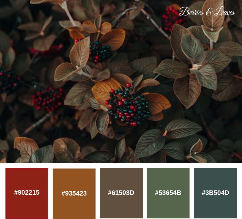
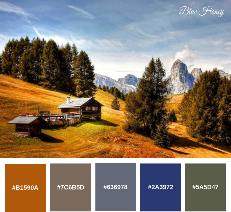
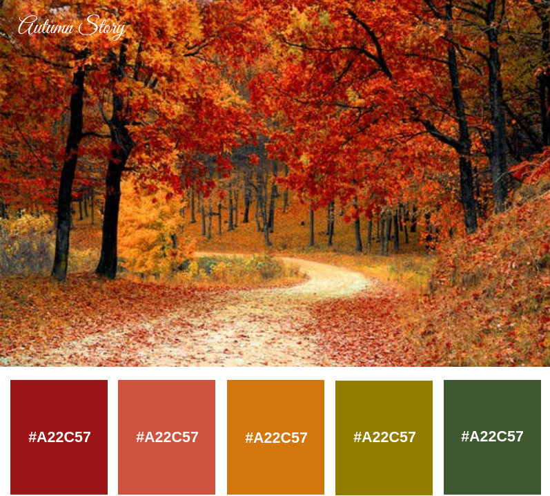
I have produced 4 autumn palettes that are inspired by travel and nature. These palettes are created close to its natural colours, based on its original images. Tested and tried countless of times, these palettes were well-received by some of my friends and clients out there and I would like to share them with you here.
Palettes are colour combinations that can be used together to achieve a ‘perfect’ representation result or effect for a piece of imagery work. Creating a palette is pretty simple and straightforward. You can do it with a breeze through Canva.
Here are the steps for most beginners out there reading this:
- Open a new document
- Tab element, select shapes
- Insert squares into the empty document (i.e If I’m creating 3 colours, I’ll insert 3 squares)
- Resize it to fit all squares in the same document
- Tab on the square you want to change colour
- Go to ‘Colour document’ at the top left corner
- Click on ‘+’ and select the colour you want
- Below the colour bar, you’ll find the colour hex code (e.g. #000000)
You can note down the hex codes for your chosen colours for future reference especially if it’s a unique colour palettes created by you.
There are many ways to interpret colours as there are millions of combinations out there. All you need is a bit of creativity. There is no right or wrong or hard and fast way when it comes to colours. Colours only speak of the “colour-author’s” character as well as the mood of the topic he or she is presenting.
Being able to identify and create your own colour regime gives you unlimited possibilities and opportunities to play with and infinite ideas to devise a piece of work in your own authentic and unique style.
Who knows, you might even have a perk in mood by hatching your own colour palettes this fall and one for every other season!
Next Read: How I Edit My Photos For Blog And Social Media

Continue Exploring …
5 Steps To Creating A Great Blog
5 Important Things To Know Before Starting A Business
Categories: Blog & Beyond, Resources


I love autumn. Beautiful captures. It’s almost autumn here. 🙂
LikeLike
Beautiful images and inspiration of colors. I agree. Colors have a significant impact on our emotions and often reflect our feelings for the day. 🙂Advertisers know how to use them well too.
LikeLike